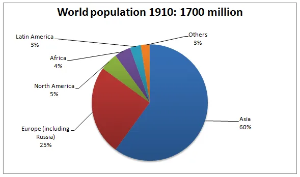
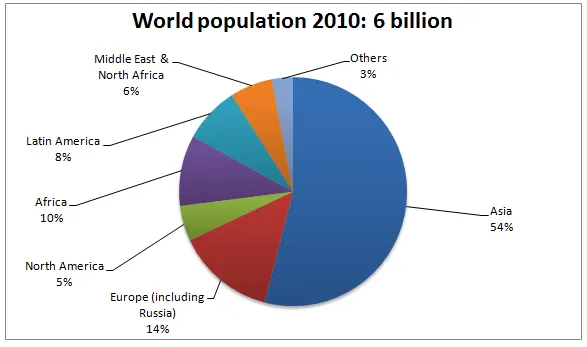
The two pie charts provide a comparison of the shifts in global population distribution across different regions from 1910 to 2010.
In general, it is clear that Asia's share of the world population increased significantly over the century, while Europe's proportion saw a substantial decline. In contrast, the other regions remained relatively stable in terms of their population percentages.
In 1910, Europe accounted for about 25% of the world's population, making it the second most populous region after Asia, which held a 60% share. However, by 2010, Europe's share had dropped dramatically to just 11%, while Asia's had risen to an overwhelming 70%.
Meanwhile, Africa maintained a steady 9% throughout the century, while the combined population of North and South America fluctuated slightly from 5% in 1910 to 7% in 2010. Oceania's share remained the smallest, at 1% in both years, and the rest of the world accounted for 5% in 1910 and 2% in 2010.