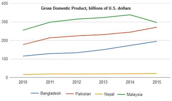
The line graph illustrates the comparison of the Gross Domestic Product (GDP) in billions of US dollars among four different nations.
At a glance, it is clear that all four countries experienced an increase in their GDP over the period, but the rates of growth varied significantly. While two countries showed a steady rise, the other two exhibited a more fluctuating pattern.
Focusing on the details, Country A and B demonstrated a steady growth in their GDP. Country A started at just under 200 billion and rose gradually to reach about 400 billion at the end of the period. Similarly, Country B also showed a consistent increase, albeit at a slower pace, starting at approximately 100 billion and ending at around 200 billion.
In contrast, the GDP of Countries C and D showed more volatility. Country C's GDP started at nearly 300 billion, peaked at around 600 billion, before falling back to roughly 500 billion. Meanwhile, Country D's GDP experienced a sharp increase from about 150 billion to 400 billion, followed by a sudden drop and a subsequent recovery to around 350 billion.