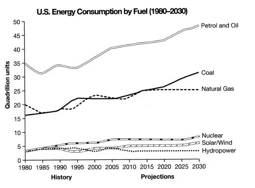
The line graph illustrates the data from a 2008 report on the use of energy in the United States, tracing its history from 1980 and forecasting its progression up to 2030.
The graph depicts a steady increase in the consumption of all forms of energy over the 50-year period. It also highlights the dominance of petrol and oil as the primary energy source, while other sources maintain a relatively lower but constant share.
From 1980 to 2008, petrol and oil usage saw a significant rise from just over 30 quadrillion units to approximately 35 quadrillion units. Meanwhile, coal consumption slightly increased from 15 to about 20 quadrillion units, and natural gas usage also rose moderately from 20 to 25 quadrillion units. The consumption of solar/wind power remained relatively low, at under 5 quadrillion units.
The projections for 2030 suggest a continuation of these trends. Petrol and oil are expected to reach nearly 40 quadrillion units, while coal and natural gas are predicted to hover around 25 and 30 quadrillion units respectively. Solar/wind energy, despite a slight increase, is forecasted to remain the least consumed energy source.