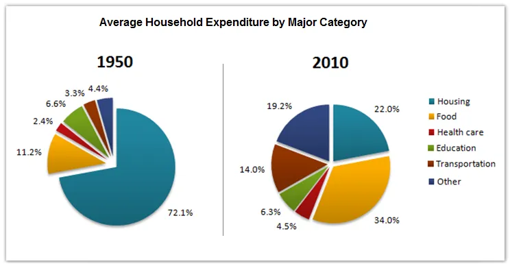
The pie charts illustrate the changes in the average family spending in a certain country between 1950 and 2010.
A general overview of the charts reveals that food was the largest expense for households in both years, but its proportion of total expenditure decreased over the 60-year period. In contrast, housing costs, which were a minor part of the budget in 1950, rose significantly by 2010.
In 1950, food accounted for well over half of the average family's expenditure at 56%, while housing was only 9%. The remaining budget was split among transportation, health care, and others, with each category taking up a roughly equal share of the remaining 35%.
By 2010, although food still remained the largest expense, its share had dropped to 24%. Housing costs had surged to 34%, making it the second largest expense. Transportation and health care costs had also increased slightly, but the 'others' category had shrunk to only 14% of total expenditure.