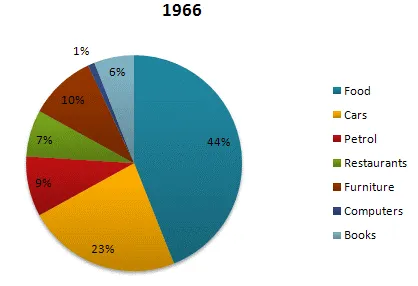
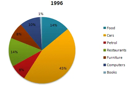
The pie diagrams illustrate the variation in the expenditure of American individuals across seven distinct sectors in the years 1966 and 1996.
In general, it is clear that the most significant expenses in both years were on food and cars, while the least amount was spent on computers. However, there was a noticeable shift in the distribution of spending over the 30-year period.
In 1966, food accounted for over a third of the total expenditure, at 44%, while car expenses represented a quarter. However, by 1996, the proportion spent on food had dramatically decreased to 14%, and car expenses had also fallen, though less markedly, to 23%.
Meanwhile, spending on computers, which was non-existent in 1966, had risen to 10% by 1996. Expenditure on restaurant and clothing remained relatively stable, with only minor fluctuations. Interestingly, the proportion of spending on housing increased significantly from 15% to 22%, while the percentage for health care saw a slight increase from 5% to 6%.