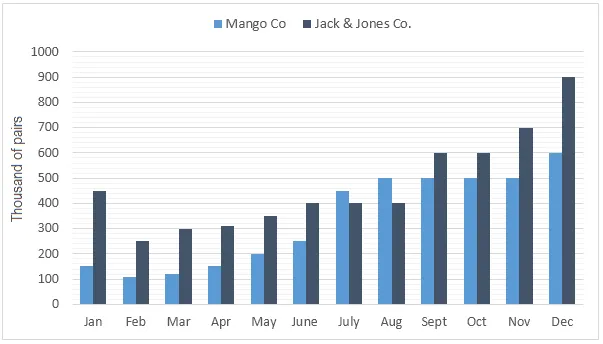
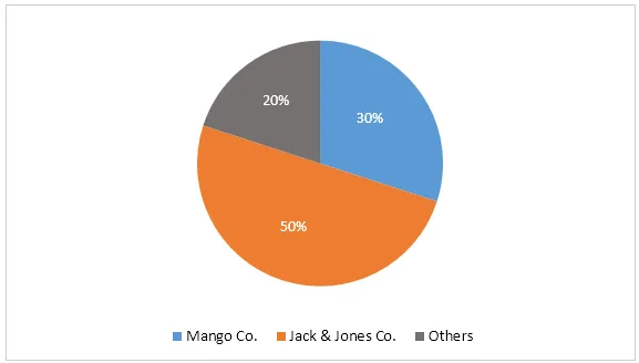
The bar graph illustrates the anticipated sales of jeans by two firms in Turkey for the forthcoming year, while the pie chart demonstrates the expected market share of these companies in the jeans sector by the end of the same year.
A general overview of the bar chart reveals that Company A is predicted to have higher sales than Company B. The pie chart, on the other hand, forecasts a near equal market share for both companies by the end of the year.
Looking more closely at the bar graph, it is evident that Company A's sales are projected to be significantly higher, at around 20 million pairs of jeans, compared to approximately 15 million for Company B. This suggests that Company A's jeans may be more popular or better marketed.
However, the pie chart indicates a different scenario in terms of market share. Despite lower sales, Company B is expected to hold nearly half of the market share, at 49%, while Company A, with higher sales, is predicted to have a slightly larger share of 51%. This discrepancy may be due to Company B having a wider variety of products or a more diversified customer base.