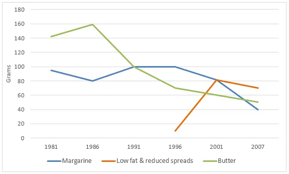
The line graph delineates the daily intake of three different types of spreads by individuals in a specific country over a period of 26 years, from 1981 to 2007.
The graph reveals a clear trend of fluctuating consumption of the three spreads over the years, with one spread showing a significant increase, another showing a decline, and the third maintaining a relatively stable intake. It is evident that the popularity of these spreads varied throughout the given period.
In 1981, the consumption of spread A was the highest, at around 140 grams per day, but it gradually declined to approximately 50 grams by 2007. On the other hand, the daily intake of spread B was initially the lowest, at about 20 grams, but it saw a steady rise over the years, surpassing the other two spreads by 2007, reaching a peak of about 160 grams.
The consumption of spread C, however, remained relatively constant throughout the period, with a slight increase from 1981 to the mid-1990s, and then a slight decrease towards 2007. It started at around 90 grams per day in 1981, peaked at approximately 110 grams in the mid-1990s, and then dropped to about 80 grams by 2007.