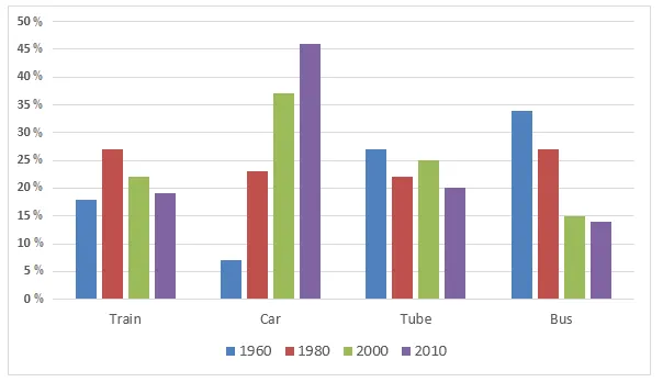
The graph illustrates the proportion of commuters in London who utilised various forms of transportation over a fifty-year period from 1960 to 2010.
It is evident from the graph that the use of cars saw a significant rise, while the popularity of buses and trains experienced a decline. On the other hand, the use of bicycles remained relatively stable throughout the period.
In 1960, over half of the commuters travelled by bus, which was the most popular mode of transport. However, by 1980, the use of buses had fallen dramatically to around 25%, and continued to decline, reaching just over 10% in 2010. Similarly, the percentage of train users also decreased from nearly 30% in 1960 to approximately 15% in 2010.
Conversely, the use of cars surged from just over 10% in 1960 to almost 40% in 1980, and then further increased to reach a peak of around 60% in 2000. Despite a slight drop in the following decade, cars remained the dominant mode of transport in 2010. Meanwhile, the percentage of bicycle users fluctuated slightly but remained at around 10% throughout the period.