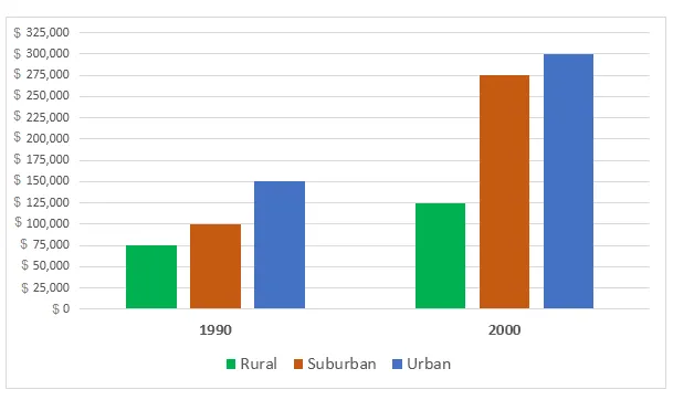
The line graph illustrates the mean housing prices in three distinct regions over a span of ten years.
It is immediately apparent from the graph that all three areas experienced a rise in housing costs, with Area C seeing the most significant increase. Conversely, Area A had the lowest overall growth, despite a few fluctuations.
In more detail, Area A started at approximately $50,000 in 2000 and, despite a slight dip in 2002, gradually rose to just under $80,000 by 2010. Area B, on the other hand, began at roughly the same price as Area A, but its growth was more dramatic, reaching about $100,000 in 2010.
Area C, however, had the most substantial increase. Starting at around $70,000 in 2000, it experienced a sharp rise to nearly $140,000 in 2005, before levelling off and ending the decade at just over $150,000. This makes Area C the most expensive region by 2010, a stark contrast to its initial position.