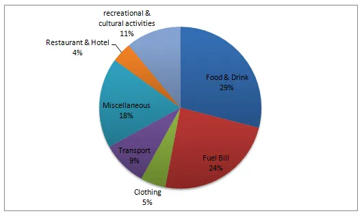
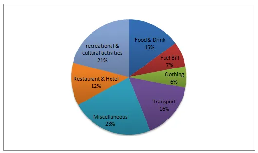
The bar charts illustrate the proportion of monthly earnings expended on different categories by two distinct demographics in a European nation.
At a glance, it is evident that both groups spend the most on food, while the least expenditure is on education. However, there is a noticeable difference in the spending patterns between the two groups across the other categories.
Looking at the first group, it is clear that they allocate a significant portion of their income to housing, which stands at around 34%. This is followed by transport and health, with approximately 15% and 12% respectively. Interestingly, they spend only a meagre 4% on education.
In contrast, the second group spends a much larger proportion of their income on transport and health, with both categories accounting for nearly 20% each. Their expenditure on housing is significantly lower than the first group, at about 22%. Similar to the first group, their spending on education is minimal, at just 3%.