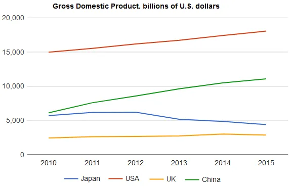
The line graph illustrates the changes in the Gross Domestic Products (GDP) of four different countries from 2010 to 2015.
From a general perspective, it is evident that all four countries experienced fluctuations in their GDP over the six-year period. However, the most significant changes were observed in countries A and B, while countries C and D demonstrated more stable trends.
Looking more closely, country A started with the highest GDP in 2010, but it experienced a sharp decline in 2012, followed by a steady increase until 2015. In contrast, country B had the lowest GDP in 2010, but it saw a dramatic surge in 2011 and 2012, and then a gradual decline for the rest of the period.
On the other hand, the GDP of country C remained relatively stable throughout the period, with only minor fluctuations. Similarly, country D also showed a steady trend, but with a slight increase from 2010 to 2013, and then a minor decrease towards 2015. Overall, the GDP trends varied considerably among the four countries during this period.