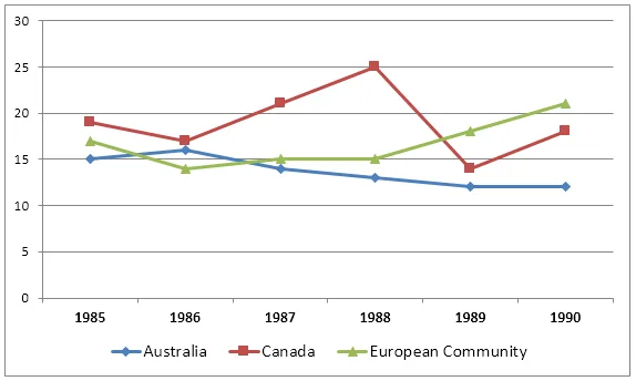
The line graph provides information about the changes in wheat exports from three distinct regions over a period of ten years.
From a broad perspective, it is clear that all three areas saw fluctuations in their wheat exports, but the overall trends differed significantly. While one region experienced a steady increase in exports, the other two saw more variable patterns, with one eventually showing a decline.
Looking at the details, the first region started at 2.5 million tonnes in the first year and, despite some minor fluctuations, had a steady rise to reach 5 million tonnes by the end of the decade. The second region, on the other hand, began at 3 million tonnes and peaked at 4.5 million tonnes in the fifth year, before falling back to its original level by the tenth year.
The third region had the most erratic pattern, starting at 4 million tonnes, peaking at 5 million tonnes in the third year, and then experiencing a sharp decline to 2 million tonnes in the sixth year. Despite a brief recovery, it ended the decade at a lower level than it started, at 3 million tonnes.