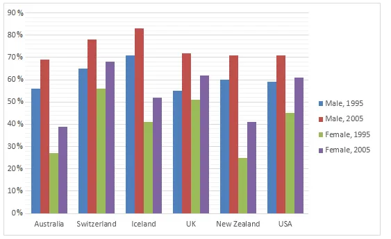
The given diagram illustrates the proportion of employed individuals in six different nations in the years 1995 and 2005.
At a glance, it is evident that over the ten-year period, the employment rates in all countries, except for one, experienced a change. The most noticeable shift was seen in the United Kingdom, which had the highest employment rate in 1995, but dropped significantly by 2005.
In 1995, the UK had the highest employment rate of around 70%, followed by Australia and New Zealand at just over 60%. The other countries - France, USA and Germany - had employment rates of under 60%. However, by 2005, the employment rate in the UK had fallen dramatically to below 60%, making it one of the countries with the lowest employment rates.
On the other hand, Australia and New Zealand saw an increase in their employment rates to approximately 70% and 75% respectively in 2005. The USA also experienced a slight increase, while France and Germany remained relatively stable. Interestingly, despite the overall downward trend in the UK, it still had a higher employment rate than France and Germany in 2005.