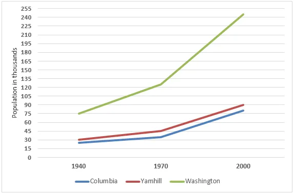
The line graph illustrates the alterations in the population of three distinct counties in Oregon, USA, from 1940 to 2000.
Overall, all three counties witnessed a growth in population over the 60-year period, with one county experiencing a particularly substantial increase. However, the rate of growth varied significantly among the counties.
In 1940, County A had the smallest population of the three, but by 2000, it had seen an extraordinary surge, becoming the most populous. Although the population growth was steady until 1970, it then skyrocketed, peaking at just over 1.6 million in 2000.
In contrast, the populations of County B and County C grew at a much slower pace. County B's population rose moderately from approximately 200,000 in 1940 to around 600,000 in 2000. Meanwhile, County C's population, which was the highest in 1940, increased slightly to reach just under 800,000 by the end of the period.