IELTS HUB
Pie Chart employmentAustraliaprofessions Graph #51
Academic Writing Task 1

You should spend about 20 minutes on this task.

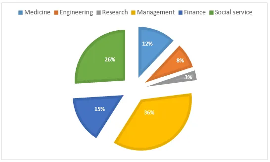
The pie chart below presents the percentage of new job opportunities for different professional groups in Australia in the year 2001.

Pie Chart: Job opportunities for professional groups in Australia 2001

Summarise the information by selecting and reporting the main features, and make comparisons where relevant.

Write at least 150 words.

One box per paragraph, then compare with Band 9.
145 words · 4 paragraphs
Introduction

The pie diagram illustrates the distribution of new employment opportunities across various professional categories in Australia in 2001.

Overview

At a glance, it is evident that the largest share of new jobs was in the professional sector, while the least was in the farming sector. The other sectors had a fairly equal distribution of new job opportunities.

Body 1

In detail, the professional sector was the most significant contributor to the job market, accounting for a third of all new jobs. This was followed by the trade and clerical sectors, each contributing approximately a fifth of the total job openings.

Body 2

On the other hand, the farming sector had the smallest share of new job opportunities, making up just over 5% of the total. The service sector and the technical sector each accounted for roughly 10%, while the remaining 15% was made up by the transport and manufacturing sectors.
Go further with the books

Academic Task 1

100 Band 9 Task 1 Samples

Real Exam Charts, Maps, and Processes

₹299$9.99CAD 13.99AUD 14.99£7.99NZD 16.99€8.99AED 39SGD 12.99

Free preview

Academic Task 1

IELTS Academic Task 1, Decoded

Graphs, Maps, and Processes Explained

₹299$9.99CAD 13.99AUD 14.99£7.99NZD 16.99€8.99AED 39SGD 12.99

Free preview

Vocabulary

Upgrade Your English

1,800 Sentences from Band 5 to Band 9

₹299$9.99CAD 13.99AUD 14.99£7.99NZD 16.99€8.99AED 39SGD 12.99

Free preview

Next question: Bar Graph #52